Friday, 10 February 2017


Wednesday, 8 February 2017
Monday, 6 February 2017
Evaluation Task 2: How effective is the combination of your main product and ancillary texts?
(Recommended to watch with volume on its loudest setting. I edited the above video based off of the notes my group and I made and filmed reading).
Friday, 3 February 2017
Notes for multi-media film (Evaluation Task 2)
Star Image
What is Dyer’s main point about ‘star images’?
Richard Dyer’s star theory is the idea that icons and celebrities are manufactured by institutions for financial gain. He believes that whilst stars are constructed to be realistic, they serve a purpose: the make money out of their audience (who respond to various elements of the star’s personality).
1. The star as a construction
The images of the artists that we are shown through advertising, television, magazines, etc, have been created by their management.
2. The star as a commodity
The star has been constructed by their record label to appeal to their target audiences. Certain music magazines feature bands or artists on the front cover as their image becomes the commodity that will attract the target audience to buy the music magazine. Artists such as Macklemore and Ryan Lewis have refused many record deals as they don’t want their image to be controlled. Therefore all their success is theirs.
3. The star as an ideology
This is what the band or artist represents and believe in, they could make this fit the target audience to gain a larger audience. The spice girls represent girl power and friendship.
Identify some real stars with similar images to that which you have attempted to construct.
MØ and Bishop Briggs
We have attempted to recreate Bishop Briggs’ alternative star image, retaining her fashion sense (which has become a large aspect of her general image) and cool persona. Similarly, we have likened our artist to that of MØ given her role as an empowering young woman, whose rebellious and anti-authoritarian attitude has greatly resonated with our target audience. She is highly individual and has a very eccentric and unconventional style which has been reflected in our own artists’ star image.
What are the key meanings of your star image?
Youthfulness and Rebellious
These two aspects are important values of our artists’ star image as they greatly appeal to our target audience and help to market our artist. Among female solo artists, the values of youthfulness and and rebellion are highly popular, and in representing these meanings in our artists’ star image we helping to identify her as a personality.
How does your video construct these star meanings?
Our video presents our artist as youthful and rebellious through a number of different means.
For instance, her association with a group of both youthful males and females makes the distinction that she is a young artist who involves herself with likeminded individuals. This helps our target audience to relate with our artist as it effectively portrays her to be like any ordinary young girl, having fun with her friends. The inclusion of male friends alongside female friends possibly also denotes a further idea of promiscuity which is often seen hand-in-hand with being young, supporting sexuality among youths. Through her actions with her friends, we see her appreciation of what it is to be young, and the celebration of the energy and excitement that young people possess. The costumes worn by this group are individual, alternative and appealing to our target audience. They are contemporary and thus relevant to the youth of today, and are considered to be highly fashionable. Equally, they serve to reflect the unique genre of music that is indie-pop. The quick paced and energetic editing of our video serves to reflect such qualities in what it is to be young and creates a fun-loving, restless atmosphere to the video, supporting such a value within our artist.
Her role as a rebel and anti-authoritarian attitude is shown through aspects of the video such as spray painting the abandoned house and skate boarding through its corridors. In both of these cases, the actions are often considered to be recalcitrant and reckless, and are regularly associated with youthful delinquency. By showing other members of her group to also be partaking in such activities, it supports the notion that these actions are widespread among the youth of today. They are acts of rebellious considering the fact that, especially in the case of spray painting, they deface property and undermine the respect of ownership and correct behaviour. It’s potential to be called ‘graffiti’ stresses the illicit nature of the act, and thus highlights our artist’s role as an anarchic young lady. Alike with how the costumes portray our star image as youthful, certain accessories also support her role as a rebel, such as the use of a choker, ripped tights, and large golden hooped earrings as these generally have connotations of the wearer having high amounts of attitude and being generally disrespectful towards people in positions of authority and their property. Our use of camera as being square-on can be seen as confrontational and direct, which emphasis our artist as being a rebel given its support in establishing her aggressive and strong attitude nature. By including a number of effects within the editing of our video, we subliminally support the quality of our artist being rebellious by going against traditional conventions, and creating visually striking images in which the world is distorted. This attracts target audiences as it is an interesting spectacle to observe.
How does your digipak construct these star meanings?
Our digipak presents our artist as youthful and rebellious through a number of different means.
The digipak’s colourful marble background successfully constructs our artist’s image as youthful given its vibrant and bright nature — which are qualities of what it is to be young. Similarly, by having our artist’s image upon the front cover of our digipak, we are showcasing her youthful appearance which attracts audiences given her beauty and reliability. By having her in black and white in contrast to the colourful background, it creates an aspect of photo-montage and associates the cover with collages which is a fun and youthful way of presenting artwork. The emphasis on the colour green used in our digipak is a direct relation to its relevance in our video, which thus offers a coherency between the two products. The colour green is often associated with freshness and fertility, thus serving to further support our artist’s youthful star image.
The pose, positioning and facial expression of our artist as square-on, with her chin-up and head held high, creates the impression that she is empowered and unafraid. This constructs her image as a rebel given the departure from traditional conventions of solo female artists in which they are sexualised and objectified. It resonates with our contemporary target audience given the role of feminism in modern day society. The appearance of a choker and hooped earrings once more support her role as a rebel given its connotations of being worn by those with attitude, and the fact that the image is in black and white aids in lessening her naive nature and instead further supports her role as a cool and courageous rebel.
How does your homepage construct these star meanings?
Our website presents our artist as youthful and rebellious through a number of different means.
Similar to our use of colour in the digipak, the colour green and vivacious marble background also make an appearance on the website, thus reaffirming our artist’s youth in a similar way. We used a simplistic design as its simple-to-use navigation serves to encourage use from a youthful target audience and the inclusion of a moving image (the gif) makes use of technology and is visually striking, which also attracts a youthful target audience given their enjoyment of such technology and originality. Equally, considering the gif shows our artist being sassy and confident, it aids in constructing her star image as a rebel. The different backgrounds, although of a similar colour scheme, used on each subpage keep the website fresh and original, which also helps in constructing our star image as youthful. The popups make the website easy to use and also interactive which once more helps create a star image of youthfulness as it means our audience are able to participate more and are thus more interested.
Audience
Who is the target audience for your promo?
From researching similar artists to our own, we discovered that the target audience for our promo is 18-25 year olds of both genders.
How do each of the three products communicate with / appeal to this audience segment?
The three products communicate and appeal with our target audience through a number of different ways, predominantly through our artist’s youthful star image as they are able to relate with them. For example, in the video, the cluster of young people, youthful activities (such as spray painting and skate boarding), stylish costumes and cool music all serve to be the epitome of what it is to be young, and as such create a benchmark for consumers to aspire to. Similarly, the rebellious undertones of the video resonate as popular with such an audience as people regularly connect with “the bad girl/boy”. In terms of the digipak and website, the vibrant and bright colours are youthful and appreciated by such a target audience, and the simple to use features and interactive potential means it it simple yet stylish for our target audience to use. Across all the products, the inclusion of our artist who is young and beautiful is attractive to such a target audience.
Cross Promotion
Explain about how your 3 products are part of one promotional, marketing campaign — what are the aims of the campaign?
The aims of the campaign are quite simply to market and promote a new female solo artist. Through the video, digipak and website it aims to advertise the release of her first studio album and establish her star image as youthful and rebellious. The video showcases her image, performance and a bit of her personality, the digipak advertises her new album and reaffirms the image established in the video, and the website provides a concise location on which information regarding the new artist can be found. On all three products, our artist’s style comes across very clearly as being very indie and unique whilst still fashionable (seen to be wearing chokers and hooped earrings in all). Equally, our use of colour is consistent across the three products, regularly using dark shades of green, red and pink due to the connotations such colours have (such as green relating to youthfulness, red relating to attitude, and pink to having fun). In each product, we also include our artist’s name of SIOUX as we figured it is important to drill such a name into potential consumers so that they will more easily recognise it in the future, and given SIOUX’s translation to ‘little snakes’ we also regularly include a snake image across our products as this will aid in promoting merchandise in the future. We also use the same font across the products, ‘Futura’, as to create a sense of synergy.
How do your 3 products promote the products and services that the record label are selling?
The video advertises our artist’s performance quality and encourages viewers to see her live on the basis that they will want to experience her vocal quality and see the attitude and personality of our artist that the video has suggested to. Similarly, the rhythmic editing of the video brings awareness to the music and gives audiences a great appreciation of it which will encourage them to buy the song and album. By including SIOUX’s name in the video, and images of snakes, it familiarises audiences with such a name and image and thus encourages them to buy her merchandise and recognise her more easily in the future (such as when her tickets go on sale). The website is an effective product of the record label to promote what other products and services they are selling, as it regularly encourages viewers to buy our artist’s new album, as well as watch her videos and attend her shows. The inclusion of being able to buy tickets right there off the website makes the process easy and effective, and shows exactly when and where she will be performing. Equally, by having links to her social networking sites, fans are encouraged to learn more about the artist’s personal life and thus become more familiar with her, which, by extension, will encourage them to buy yet more of her products (whether concert tickets, albums, or merchandise) in the future. The ability to sign up for a newsletter means that her audience will be able to stay up to date with all SIOUX related news, and as such this would successfully encourage them to buy her latest releases and performances given how they are the first to hear about such news. The digipak encourages audiences to obviously buy the album and the tracks included on it, but also encourages them to watch future videos and further familiarise themselves with the music which in turn would inspire them to see the artist live and attend her concerts.
Does your promo attempt to construct a branding for your artist, for example through the use of a logo?
Just through her distinct name of SIOUX as this encourages immediate recognition from audiences, and a rapid distinction amongst the masses of solo female artists.
Tuesday, 31 January 2017
Evaluation Task 3: What have you learned from your audience feedback?
Recommended to watch in highest quality and on full screen:
TRANSCRIPT OF THE VIDEO ABOVE:
1. Evaluation Task 3: What have you learned from your audience feedback?
2. At the start of the A2 course, I came up with three different ideas for a possible music video to make: IDEA ONE -- IDEA TWO -- IDEA THREE
3. I then presented these ideas to my class, and received the following feedback:
2. At the start of the A2 course, I came up with three different ideas for a possible music video to make: IDEA ONE -- IDEA TWO -- IDEA THREE
3. I then presented these ideas to my class, and received the following feedback:
4. PRESENTING MY INITIAL IDEAS TO THE CLASS: Taken from the blog post I wrote back on the 9th of September, summarising the feedback I received from my pitch: “Overall, the second and third ideas were the most liked. People generally thought the ‘Stabat Mater’ idea was aesthetically pleasing and ‘visually inspiring’, with the ballerina-ribbon idea being particularly effective. The ‘Pray (Empty Gun)’ idea was also liked given its simplicity, but people were concerned that the idea would fall flat without a capable lead-singer. The first idea, whilst striking and memorable, would be difficult to execute as is it is just a bit too complex. Taking this advice in mind, when put into my group I am going to progress forward mostly with the second and third idea. Given the simplicity (which is enjoyed) of the 'Pray (Empty Gun)' idea, this will probably be my frontrunner and I will do what I can to begin finding the right girl, but I am also eager to further develop and explore the 'Stabat Mater' idea as well.” LINK
5. After which, we were split into groups of three. As a group, we went through all of our nine ideas together and cut them down to just two. Based off of the audience feedback, we all agreed that ‘Pray (Empty Gun)’ would be a strong idea to pursuit further, and as such selected it as our collective frontrunner. As a back up, we decided on Hannah’s ‘Amber Run’ idea. Taken from the blog post I wrote on the 12th of September, summarising our initial steps as a group following our pitches: “Unanimously, we decided upon selecting ‘Pray (Empty Gun)’ as our main idea but decided that the third element needed to be changed. We all liked the memorable images, initial plans for the look of the lead singer and the song itself — although, we did think it wise to cut the song down to 3 minutes instead of 4. We also thought it prudent to find a way to include the red ribbon idea from the ‘Stabat Mater’ music video plan given its immensely popular approval. To make the video more interesting, we thought of changing the two dancers to two males (given the fact that this isn’t overtly common) and the drummer to a female (as this is likewise quite rare). Our artist would also now be a solo artist. … In terms of our second plan to further develop, we are initially thinking of Hannah’s ‘Heaven’ idea by Amber Run consisting of a band and an out-side playground element.” LINK
5. After which, we were split into groups of three. As a group, we went through all of our nine ideas together and cut them down to just two. Based off of the audience feedback, we all agreed that ‘Pray (Empty Gun)’ would be a strong idea to pursuit further, and as such selected it as our collective frontrunner. As a back up, we decided on Hannah’s ‘Amber Run’ idea. Taken from the blog post I wrote on the 12th of September, summarising our initial steps as a group following our pitches: “Unanimously, we decided upon selecting ‘Pray (Empty Gun)’ as our main idea but decided that the third element needed to be changed. We all liked the memorable images, initial plans for the look of the lead singer and the song itself — although, we did think it wise to cut the song down to 3 minutes instead of 4. We also thought it prudent to find a way to include the red ribbon idea from the ‘Stabat Mater’ music video plan given its immensely popular approval. To make the video more interesting, we thought of changing the two dancers to two males (given the fact that this isn’t overtly common) and the drummer to a female (as this is likewise quite rare). Our artist would also now be a solo artist. … In terms of our second plan to further develop, we are initially thinking of Hannah’s ‘Heaven’ idea by Amber Run consisting of a band and an out-side playground element.” LINK
6. Developing the ‘Pray (Empty Gun)’ idea as a group, we decided to make a few changes but ultimately kept the concept as simple as possible, as this is what the audience said they enjoyed most about the idea. We then presented the idea to Luke.
7. PITCHING TO LUKE: Taken from the blog post I wrote back on the 15th of September, summarising the feedback I received from my pitch to Luke: “To summarise: the idea was given permission for us to move further forward into development, but there were a number of concerns about a lack of elements and an issue with the setting of the second location looking possibly tacky. Luke thought the first location was effective with all the smoke and lighting and that given the drummer and dancer elements, alongside the lip-syncing, we had a lot to play with. He didn't, however, rate the speaker and paint idea too highly as a really powerful slow-motion camera would be needed (which would require paid hiring) and would likely not work as effectively as we envision it to. The second location, whilst he liked the idea of, he thought could look tacky if it were made as a set within the studio, although, he did enjoy the contrast between the first and second location. Regarding the gangster memorabilia (i.e: the money and weapons), he advised us to make it less obvious but that it was indeed necessary for our artist to have something to do and play with whilst in the room, so agreed that it would be possible. There was concern, however, that this location could get boring but we assured him that we'd keep cutting back to the dancers and drummers from the previous scene. The ribbon idea was liked due to its theatrically, but was cited as perhaps not suiting the theme of the music video. He did, however, enjoy our use of colour. There was no issue with the costumes. “Moving forward, we are cautious that we may need to think of a third location (especially in order to tie in our narrative ribbon idea) that is street/New Money/gangsta related - as well as more elements to assure the video isn't boring. However, at the same time, we don't want the video to get cluttered. In terms of further development, we are going to confirm our casting choices and then begin some test shoots to assure we have made the correct casting decision as well as to see whether or not our ideas work and how we can further adapt them to make them more interesting and unique. We are also going to get some inspiration as to how we can make our video more interesting, and also research some additional locations. Although we had a back-up idea prepared to pitch, given our first idea being approved of, there was no need to likewise present that and so we have decided to no longer move forward with developing it. All our attention and focus will now be on our Pray (Empty Gun) idea.” LINK
8. After talking with Luke, we decided to centre our entire music video in one location with multiple sets (an abandoned house) given his fear of the video becoming stagnant and the settings boring, and thus created the concept of a group of girls playing truant and being rebellious as to facilitate such a decision. We also came up with numerous activities for them to do as ultimately the feedback we received was that the video could end up being too simplistic. With so much going on, this would ensure the video was constantly interesting and entertaining for our audiences. We storyboarded this new development and then made an animatic as to better present our idea.
9. After screening the animatic to our class and teacher, we received the following feedback:
10. SCREENING MY ANIMATIC TO MY CLASS AND TEACHER: Taken from the blog post I wrote on the 31st of October, summarising the feedback we received succeeding the screening of our animatic: “After watching the animatic, the general initial feedback was positive: people enjoyed it. … People thought it was very effective. Our use of colour and annotations (as to make clear what was going on within the shots) was very well appreciated, and the fact that it had been successfully edited to our chosen track helped in terms of visualising our final product. One member of the target audience described it as “awesome”, believing that we had a clear and interesting idea. Our music video was well planned out in his opinion and would be very entertaining to watch in its final format. Someone wondered if there was a particular narrative or concept to our piece, but when explained of our anticipation to keep the video as more of an aesthetic piece, he thought it would be successful as the idea that these girls were ‘badass’ came through in the animatic. There was also worry that the lip-syncing sequences would drag and that the rollerskating aspect may not fit with the rest of our music video; also, they questioned as to whether or not we would actually be able to successfully flood the bathroom. The dancing within our video was not disliked, although they thought the idea of comedic ‘bad’ dancing did not quite fit with the rest of our music video. However, the video arch of our music video was enjoyed. Listening to their feedback and developing onwards, we have decided it both most prudent and really rather necessary to film an actual test shoot, trying as best as we can to make the closest possible prototype of what our final product will look like — otherwise, we will not know if the lip-syncing sequences get boring, or if the comedic moments such as with the rollerskating and dancing jars with the rest of the video. … Despite that, however, we are very pleased with the feedback and reception from the audience.” LINK
11. The feedback we received from our class and teacher convinced us that our concept would successfully stand as a music video. This encouraged us to go forward with our idea. After having filmed the video, and made rough cuts of the video, digipak and website — we presented them to a focus group.
12. HOLDING A FOCUS GROUP TO GET FEEDBACK ON THE ROUGH CUTS OF MY VIDEO, DIGIPAK AND HOMEPAGE: Taken from the blog post I wrote on the 3rd of December, summarising the feedback we received succeeding our focus group, and our evaluation of the data received: Feedback regarding the Website: They thought the website was high-end and "exclusive" with many enjoying the colour scheme. However, the images did not mach the style of the digipak; the website alluded to a more Adele, 'soul' styled singer-songwriter rather than the 'bad girl', attitude indie-pop artist as seen from the digipak. They also wanted a more gender-balanced shop, but liked the design of the snake. With the exception of the aforementioned pictures, the website was otherwise viewed as being generally, fairly coherent with the digipak, with some also believing that it was somewhat coherent with the video itself as well. They recommended a spray paint element to be seen on the website as well. Most thought that perhaps the website was 'too refined' for the elements included within the video, and proposed it became more ‘street'. Feedback regarding the Digipak: Our focus group compared the artist to Lorde, Taylor Swift and Ariana Grande. They thought the genre was indie-pop, but may feature a depressing tone or even a rap element. It gave off a high fashion, attitude-heavy 'bad girl' vibe. They recommended including a spray painted element on the digipak given its relevance in the music video, and they also wanted more of a green colour palette to make the products more coherent. The digipak was noted for being different to the website and video, many calling it 'too dark', and the snake elements that were included made very little sense (until they found out what the name meant - the name of 'SIOUX' itself being universally enjoyed by the focus group). Feedback regarding the Video: There was no feedback offered as to how we could improve the video. “In general, the feedback was very positive. Whilst all three products were really enjoyed individually, as a collective they thought unity was lacking, and we (as a group) agree. Moving on from this focus group, we are going to develop our products so that they are incredibly coherent to one another in style and attitude, and to do so, we are going to review our products based off how well they represent our artist's star image qualities: youthful, rebellious, cool and chilled. Specifically, we are going to make the digipak more colourful and less snake-orientated, as otherwise the correct genre and attitude were given off; it simply needs to be more 'youthful' which will be achieved by a more animated and colourful design. Regarding the website, we are going to simplify it further by getting rid of all texts (such as the biography), and instead make it more visually striking. In similar fashion to the digipak, we are going to make it more youthful through colour and animated designs, as well as making it less 'upmarket' in order to reaffirm this 'bad girl' attitude which we showcased in the video. In terms of the video, we are merely going to give it a final polish. We are purposefully going to ignore their recommendation to include more spray painting on the digipak as it is an element within one video of our artist's album and not something which encapsulates or displays her identity or persona.” LINK
13. Our video was liked, and thus the feedback received from our focus group inspired no further changes to the edit. Regarding the digipak and website, our rough cuts were viewed as being too formal and didn’t fit in with the fun-loving carnivalesque and apathetic, ‘cool’, “almost grunge” style of the video. As such, we felt it necessary to adapt them and make them more coherent with our main product.
14. Here are our ultimate three products. We wouldn’t have been able to get to this point without the feedback that we received along the way. Our journey has been possible thanks to constantly keeping in touch with our target audience, as they have enabled us to understand what people like and want to see more of.
Thursday, 12 January 2017
Wednesday, 11 January 2017
Website
Having finished the website, we decided to test how it looked on numerous browsers and screen sizes. Unfortunately, as we expected, despite how good it is Wix is unable to automatically adapt to each of these variant platforms.
Consequently, we decided to take a screengrab of what the website looks like on an Apple Mac, as this is the computer we configured the website upon. In light of this discovery, we recommend that all future viewers likewise try to navigate the website on an Apple Macbook, or at least a laptop, to ascertain the best possible experience.
Saturday, 17 December 2016
Building the instagram
Given how the website is a big job to complete by one's self, early on in the process I extended an offer to take control of SIOUX's instagram on Hannah's behalf so that she could focus on the more important aspects of the website.
Whilst social networking sites are important, their main function is to add a further depth to the website and make the artist appear more realistic and authentic, offering audiences an insight into their personal life. As such, I made my posts personalised and genuine - often addressing or updated SIOUX's supposed followers regarding big things occurring within her busy life.
Thanks to the easy-to-use software and simplistic tools on instagram, making her account look alive and active proved to be less of a problem than at first thought. The real issue was that it was time consuming, but consistent posting every now and then made the process easy and painless.


The process was literally as simple as selecting a photo I wished to share, cropping out any unwanted details or making minor colour corrections, and then adding a caption!


The finished instagram account can be viewed here.
Friday, 16 December 2016
Contacting Fran about the Digipak
As Fran had to go back home a few days early for Christmas, she sent her latest update of the digipak over to us through the school email system whilst Hannah and I worked on the website:

Hannah and I loved it, but there were a few minor changes which we thought could be corrected as to ascertain the best possible product which our teacher Phil agreed with. Consequently, we sent a reply swiftly in response so corrections could be made as quickly as possible in order to spend as little of Fran's holiday time as possible.

Fran made the adjustments and replied soon with:

Everything we had commented on had been addressed, but in doing so a bit of the layout was messed up. Consequently, she made yet further changes before sending a final draft of the digipak:

All very happy with the digipak, we agreed that it had been completed and that Fran had done an amazing job with it!
Thursday, 15 December 2016
Creating a gif
Having decided to feature a gif as our website's centrepiece, I set about making one assisted by Hannah. We wanted to use a particular movement, rather than a still image (as we had with the test gif).
First of all, we re-watched our video and found a particular movement which we found captivating. Taking this moment, we exported it into iMovie and therein duplicated it. With the copied clip, we reversed it as to create a moment in which SIOUX appeared to move one way and then seamlessly the other way. We also slowed this movement down as to make it more significant and less hectic.


We exported our short clip and posted it to Youtube before turning to into a gif thanks to GIPHY's create-a-gif tool.


The final result was as followed:

Tuesday, 13 December 2016
Final Digipak Research
As a form of last minute research, Phil (our teacher) brought in a number of CD covers and digipaks for us to look through as final inspiration before completing our own.

This gave us a last opportunity to consolidate our knowledge of digipak conventions and see if we needed to change anything about our design. In particular, we looked at these two digipaks:


and


Most importantly from this research, we realised that a smaller font for the track list on the back of the digipak was more effective. As such, we will make the change accordingly.
Monday, 12 December 2016
Building a website
Given how Hannah was not at school today, I tried my hand at making a website, assisted by Fran. We wanted to create something that would link to the digipak seamlessly and retain the best features from Hannah's version of the website. Consequently, I used the same marble pattern for the homepage's background.
I built the website on wix, starting from scratch. Regarding the homepage, after sorting out the background I made four buttons (LISTEN, FOLLOW, TOUR and ABOUT) which linked to respective pages, and placed them in each corner of the page. In the centre, I at first put an image of Juli with her 'SIOUX' logo, and then developed this further so that it was an animated gif. I also made a new 'PRAY' logo (following the same steps as creating the SIOUX logo) to fit below.


I made the gif through making multiple photos of Juli in which she changes position ever so slightly, and then placing them together to make a video. Once uploaded to youtube, I was able to turn it into a gif. Whilst basic, the gif is effective in showing the type of effect we wish to achieve. It will not, however, be our final product.


Based off of MØ's website, I also created a lightbox in which our music video for Pray (Empty Gun) plays automatically upon loading the homepage screen.

I thereafter developed each of the four pages. On LISTEN, creating another lightbox advertising the release of SIOUX's latest album, 'Pray', followed by links to music streaming platforms (iTunes, Apple Music, Spotify and Google Play). On FOLLOW, I had a lightbox in which navigators of the website could sign up for her newsletter and then links to each of her social media platforms which we have developed to a good level and also link to the three products coherently. We took inspiration from Lorde and Charlie XCX's social networking platforms. Here is a look at SIOUX's tumblr (which Hannah made):


Friday, 9 December 2016
Hannah's website
Following our latest desires to make a more simplistic yet stylish website, Hannah went away and begun work on the product. Styling it off of Sia's and MØ's websites, this is what she produced:
Whilst her efforts were appreciated, Fran and I both agreed that the general look of the website simply didn't work. The layout was effective and simple to use, but the pages not necessarily useful or wanted and the colour scheme inconsistent with the updated plan. She had used marble, but not the same marble that Fran had used in the digipak thus losing the coherency, and the inclusion of stars made little sense. However, the features included were clever and just what we wanted: the auto-playing video, the tour dates, the newsletter sign up - all of which, good.


Given Hannah's lack of time, Fran and I have decided to try our own hand at making a website, leaving the social networking sites in Hannah's capable hands. I, however, having already started on the Instagram, would take care of that.
Thursday, 8 December 2016
Change to Digipak
In attempt at making the digipak more youthful, I advised Fran to include more colour on our digipak, and as such she went away and researched a few ideas - one of which being the use of coloured marble.

Using a couple of photos of marble and turning them green through photoshop, Fran redrafted the original digipak, using the font of 'Futura' to add coherency across our products.
Showing me a draft, I was very pleased with the new change in direction which Fran was taking, but encouraged her to make the images slightly darker as it was the black and white of the first digipak which helped participants in our focus group to identify the genre as being indie pop (although they too asked for more colour). I also suggested that she used the same marble theme from the front cover on the back cover to add consistency and keep all four panels similar to one another.
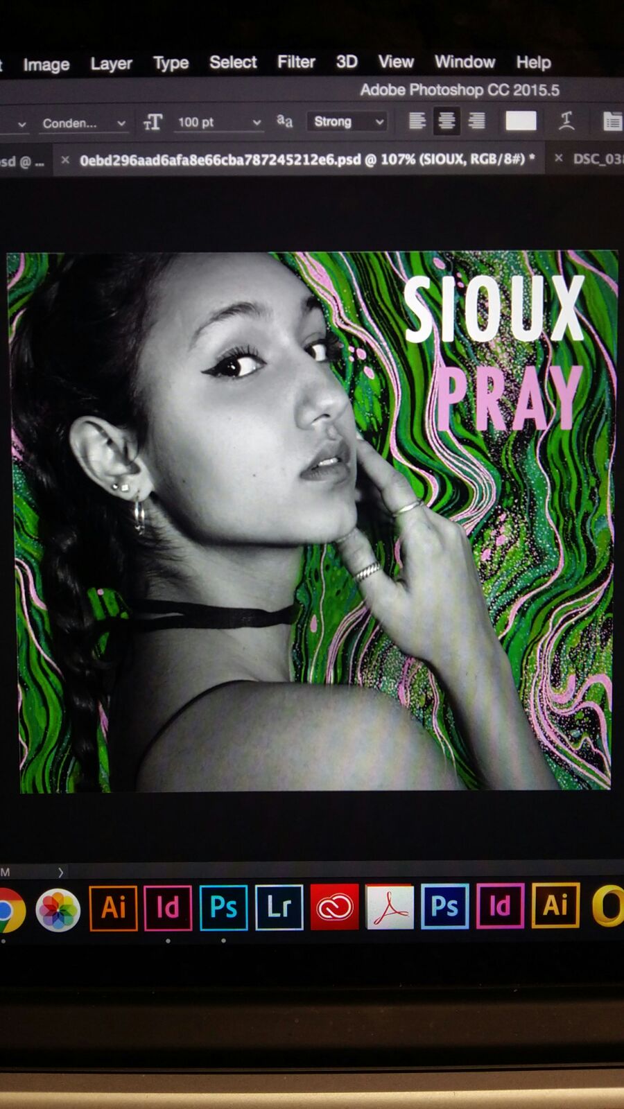
The fact that our artists' head has also been slightly cut off of the digipak is something else of note, and so Fran is going to go away and make the suggested changes before presenting an updated and improved version sometime soon.
Wednesday, 7 December 2016
Songs on Album
In order to progress further ahead with the digipak, we came up with some names for the rest of our artist's songs on her debut album:
(in no specific order)

- PRAY (EMPTY GUN)
- WILD HORSES
- RIVER
- THE WAY I DO
- BE YOUR LOVE
- ROLLING DICE
- ALONE
- WHITE BLOOD
- DEAD MAN'S ARMS
- LOVE TO HATE IT
- WALK THIS WAY
The songs are predominantly taken from real Bishop Briggs singles, however we have also included certain songs which inspired us along the way such as MØ's 'Walk This Way' and Offbloom's 'Love to Hate It', for example.
Tuesday, 6 December 2016
Cleaning up the cut
Having produced the above rough cut for our focus group (of which the feedback was very positive), I made a few final touches to our video (namely changing the lengths of some shots, adding a few extra cut-aways and finally colour coding it all, as well as changing the framing of our video for a more polished final cut).

For instance, I extended the shot of her opening lipsync slightly so that she was able to finish each of her sentences before the video cut to one of her group members, as this gave the cut a cleaner look whilst still retaining its role in highlighting the beat with each cutaway; and I also included a close up as to cover up a continuity error previously seen with the mid-shot.

Another change made was with the framing of the video itself. The inclusion of a cinematic, black border made the video look more professional and polished, and was as such added.

The door opening towards the end of the song was another aspect of the video which I cleaned up, as I was advised it to make the cut more obvious (despite the continuity error of the lollypops).
Finally, the colour coding of the video was also something which we viewed as significantly touching up the video. To do this, I had to individually correct every single shot and make it cooler, as right from the start of our project, this was the look which we wanted to achieve.
Below is our final, finished product of which we are all very pleased with:
Subscribe to:
Posts (Atom)