Saturday, 17 December 2016

Building the instagram

Given how the website is a big job to complete by one's self, early on in the process I extended an offer to take control of SIOUX's instagram on Hannah's behalf so that she could focus on the more important aspects of the website.

Whilst social networking sites are important, their main function is to add a further depth to the website and make the artist appear more realistic and authentic, offering audiences an insight into their personal life. As such, I made my posts personalised and genuine - often addressing or updated SIOUX's supposed followers regarding big things occurring within her busy life.

Thanks to the easy-to-use software and simplistic tools on instagram, making her account look alive and active proved to be less of a problem than at first thought. The real issue was that it was time consuming, but consistent posting every now and then made the process easy and painless.


The process was literally as simple as selecting a photo I wished to share, cropping out any unwanted details or making minor colour corrections, and then adding a caption!


The finished instagram account can be viewed here.

Friday, 16 December 2016

Contacting Fran about the Digipak

As Fran had to go back home a few days early for Christmas, she sent her latest update of the digipak over to us through the school email system whilst Hannah and I worked on the website:


Hannah and I loved it, but there were a few minor changes which we thought could be corrected as to ascertain the best possible product which our teacher Phil agreed with. Consequently, we sent a reply swiftly in response so corrections could be made as quickly as possible in order to spend as little of Fran's holiday time as possible.


Fran made the adjustments and replied soon with:


Everything we had commented on had been addressed, but in doing so a bit of the layout was messed up. Consequently, she made yet further changes before sending a final draft of the digipak:


All very happy with the digipak, we agreed that it had been completed and that Fran had done an amazing job with it!

Thursday, 15 December 2016

Creating a gif

Having decided to feature a gif as our website's centrepiece, I set about making one assisted by Hannah. We wanted to use a particular movement, rather than a still image (as we had with the test gif).


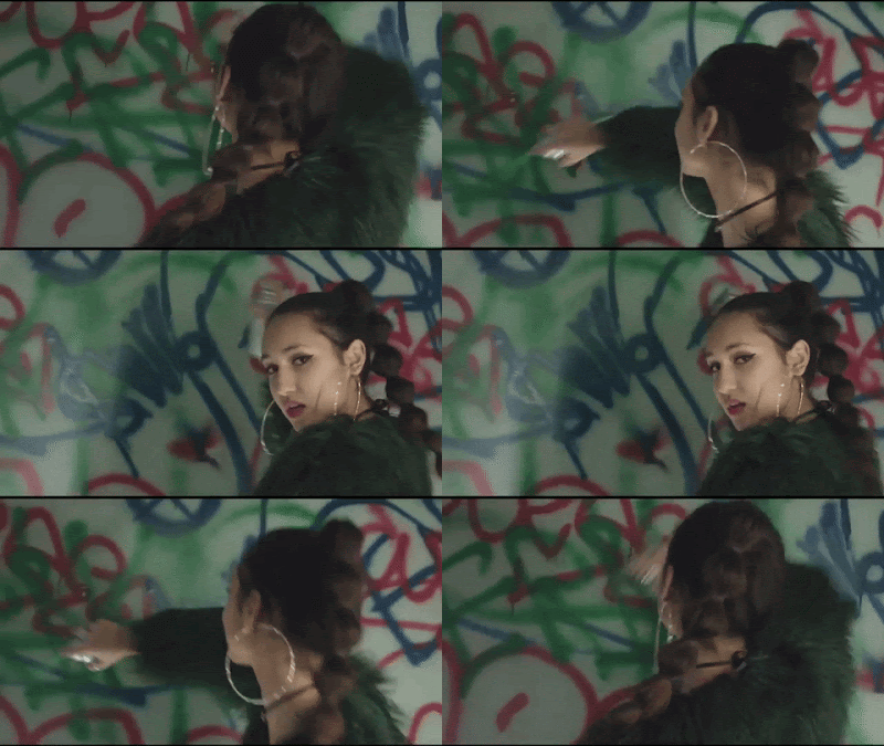
First of all, we re-watched our video and found a particular movement which we found captivating. Taking this moment, we exported it into iMovie and therein duplicated it. With the copied clip, we reversed it as to create a moment in which SIOUX appeared to move one way and then seamlessly the other way. We also slowed this movement down as to make it more significant and less hectic.


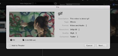
We exported our short clip and posted it to Youtube before turning to into a gif thanks to GIPHY's create-a-gif tool.


The final result was as followed:


Tuesday, 13 December 2016

Final Digipak Research

As a form of last minute research, Phil (our teacher) brought in a number of CD covers and digipaks for us to look through as final inspiration before completing our own.


This gave us a last opportunity to consolidate our knowledge of digipak conventions and see if we needed to change anything about our design. In particular, we looked at these two digipaks:


and


Most importantly from this research, we realised that a smaller font for the track list on the back of the digipak was more effective. As such, we will make the change accordingly.

Monday, 12 December 2016

Building a website

Given how Hannah was not at school today, I tried my hand at making a website, assisted by Fran. We wanted to create something that would link to the digipak seamlessly and retain the best features from Hannah's version of the website. Consequently, I used the same marble pattern for the homepage's background.


I built the website on wix, starting from scratch. Regarding the homepage, after sorting out the background I made four buttons (LISTEN, FOLLOW, TOUR and ABOUT) which linked to respective pages, and placed them in each corner of the page. In the centre, I at first put an image of Juli with her 'SIOUX' logo, and then developed this further so that it was an animated gif. I also made a new 'PRAY' logo (following the same steps as creating the SIOUX logo) to fit below.


I made the gif through making multiple photos of Juli in which she changes position ever so slightly, and then placing them together to make a video. Once uploaded to youtube, I was able to turn it into a gif. Whilst basic, the gif is effective in showing the type of effect we wish to achieve. It will not, however, be our final product.


Based off of MØ's website, I also created a lightbox in which our music video for Pray (Empty Gun) plays automatically upon loading the homepage screen.


I thereafter developed each of the four pages. On LISTEN, creating another lightbox advertising the release of SIOUX's latest album, 'Pray', followed by links to music streaming platforms (iTunes, Apple Music, Spotify and Google Play). On FOLLOW, I had a lightbox in which navigators of the website could sign up for her newsletter and then links to each of her social media platforms which we have developed to a good level and also link to the three products coherently. We took inspiration from Lorde and Charlie XCX's social networking platforms. Here is a look at SIOUX's tumblr (which Hannah made):


For the TOUR page, I used the 'bandintown' widget to create a tour ticket booking list and page (for now using the default information), and for the ABOUT page, we spoke a little bit about SIOUX and her background alongside a gallery of photos.


We are very pleased with the website which we now have, although do not believe it to be completed just yet. Over the next few days we are going to review the website and see further ways in which we can improve it.

Friday, 9 December 2016

Hannah's website

Following our latest desires to make a more simplistic yet stylish website, Hannah went away and begun work on the product. Styling it off of Sia's and MØ's websites, this is what she produced:


Whilst her efforts were appreciated, Fran and I both agreed that the general look of the website simply didn't work. The layout was effective and simple to use, but the pages not necessarily useful or wanted and the colour scheme inconsistent with the updated plan. She had used marble, but not the same marble that Fran had used in the digipak thus losing the coherency, and the inclusion of stars made little sense. However, the features included were clever and just what we wanted: the auto-playing video, the tour dates, the newsletter sign up - all of which, good.


Given Hannah's lack of time, Fran and I have decided to try our own hand at making a website, leaving the social networking sites in Hannah's capable hands. I, however, having already started on the Instagram, would take care of that.

Thursday, 8 December 2016

Change to Digipak

In attempt at making the digipak more youthful, I advised Fran to include more colour on our digipak, and as such she went away and researched a few ideas - one of which being the use of coloured marble.


Using a couple of photos of marble and turning them green through photoshop, Fran redrafted the original digipak, using the font of 'Futura' to add coherency across our products.

Showing me a draft, I was very pleased with the new change in direction which Fran was taking, but encouraged her to make the images slightly darker as it was the black and white of the first digipak which helped participants in our focus group to identify the genre as being indie pop (although they too asked for more colour). I also suggested that she used the same marble theme from the front cover on the back cover to add consistency and keep all four panels similar to one another.


The fact that our artists' head has also been slightly cut off of the digipak is something else of note, and so Fran is going to go away and make the suggested changes before presenting an updated and improved version sometime soon. 

Wednesday, 7 December 2016

Songs on Album

In order to progress further ahead with the digipak, we came up with some names for the rest of our artist's songs on her debut album:

(in no specific order)

  • PRAY (EMPTY GUN)
  • WILD HORSES
  • RIVER
  • THE WAY I DO
  • BE YOUR LOVE
  • ROLLING DICE
  • ALONE
  • WHITE BLOOD
  • DEAD MAN'S ARMS
  • LOVE TO HATE IT
  • WALK THIS WAY
The songs are predominantly taken from real Bishop Briggs singles, however we have also included certain songs which inspired us along the way such as MØ's 'Walk This Way' and Offbloom's 'Love to Hate It', for example.

Tuesday, 6 December 2016

Cleaning up the cut


Having produced the above rough cut for our focus group (of which the feedback was very positive), I made a few final touches to our video (namely changing the lengths of some shots, adding a few extra cut-aways and finally colour coding it all, as well as changing the framing of our video for a more polished final cut).


For instance, I extended the shot of her opening lipsync slightly so that she was able to finish each of her sentences before the video cut to one of her group members, as this gave the cut a cleaner look whilst still retaining its role in highlighting the beat with each cutaway; and I also included a close up as to cover up a continuity error previously seen with the mid-shot.


Another change made was with the framing of the video itself. The inclusion of a cinematic, black border made the video look more professional and polished, and was as such added.


The door opening towards the end of the song was another aspect of the video which I cleaned up, as I was advised it to make the cut more obvious (despite the continuity error of the lollypops).

Finally, the colour coding of the video was also something which we viewed as significantly touching up the video. To do this, I had to individually correct every single shot and make it cooler, as right from the start of our project, this was the look which we wanted to achieve.

Below is our final, finished product of which we are all very pleased with:

Monday, 5 December 2016

Creating a logo for our artist

Having decided what we needed to change about our products following the focus group last Friday, Hannah made the bold decision to make a new website from scratch instead of just developing upon her rough copy, as she claimed that the template was restraining her creative freedom. Consequently, we delve into our previous research as a duo and decided that the convention of our genre of choice was for the website to be somewhat overly simplistic in style - something we originally snubbed but now decided was the right way to go. In particular, we thought that Charlie XCX's, Lorde's, and MØ's websites were similar to what we thought would best suit our artist.


For MØ's website, as an example, the layout is aesthetically pleasing and very easy to use, with each link sending the user to a new webpage. However, across these multiple webpages, there is a similar visual style. In particular, her logo. The same can be seen of Charlie XCX and Lorde. Consequently, we decided it prudent to make a logo for our artist.

Hannah began drawing a few ideas down on paper, which I then tried to recreate on Photoshop:


I started with writing down SIOUX's name in Futura font - the meaningfulness behind this, the fact that as a group we have decided to use such a font across all of our products in order create a sense of consistency and coherency.


Effective, but basic, I then researched some free online snake templates which I could use. Despite the fact that the focus group didn't like the snakes originally, once they found out it was related to the meaning behind her name (which they loved) they were all much more onboard with the idea. By including snakes in her logo, our logic was that the idea would be even more well received the next time around. Equally, by including snakes in the logo it would compensate for all the snake memorabilia that we are then going to remove on the digipak and such.


Finding one, I imported it into photoshop and therein colourised it, so that the previously red snake template became green.


I then placed this image above the text of SIOUX.


Visually, I now thought that I had achieved a fairly effective logo, although it was still somewhat too simplistic for my liking. As such, I doubled the text layer and then painted the writing the same colour as the snake's light green underbelly, placing it below the black text as a form of reverse shadow.


Pleased, I then selected the dark green pattern of the snake and added some extra detail to the reverse shadow.


At this point, I was happy with the logo and contemplated stopping there. However, upon reviewing Hannah's original drawings, I noticed that the snake weaved within the letters of SIOUX's name. Consequently, I sorted out my snake accordingly and declared my logo finished for Hannah to use if she so desired.